The need for a visual identity only grows these days as digital experiences are rendered across an increasing number of devices mobile phones and tablets extend to smart TVs and kiosks in store front windows and even wearable technology. The situation becomes even more complex with Headless CMS. With content decoupled from its output and distributed via API to various front-end applications, the administrative control of appearance is not as straightforward as with a conventional CMS. Therefore, organizations must be more deliberate to ensure each avenue visually represents one brand; a visual identity is crucial for supporting such features across varied applications at the mercy of how they render.
H2: The Problem of Visual Disjointedness via the Flexibility of Headless Architecture
The beauty of flexible headless architecture is that content can be created once and used across multiple channels. Yet at the same time, it facilitates visual disjointedness. Each potential frontend can be built in its corresponding technology (think: mobile applications vs. browsers vs. VR headsets) and unless careful measures are taken, typography, colors, spacing, and other visual elements can go off-brand. Without a universal theming engine, some design requirements will either be overlooked or omitted. Unfortunately, when audiences see different iterations of a brand from one touchpoint to the next, it does not generate trust and ultimately hurts brand equity. To avoid such disjointedness, brands need to acknowledge their visual identity exists beyond the screen and transform it into a vessel to promote cross-platform guided, usable, systemic design decisions. Choosing the fastest headless CMS can help ensure that these consistent experiences are not only well-structured but also delivered quickly and efficiently across all channels.
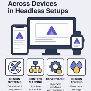
H2: Design Systems Need To Be The One Source of Visual Truth
Design systems are essential to successfully managing headless executions with visual consistency. They create the one source of visual truth when it comes to UI components, buttons, cards, typographic treatments, color palettes and white space; everything should be the same no matter who is building the front-end experience. After all, each application pulls content from the same CMS but uses it through various components. Yet if those components are pulled from a unified design system instead, the application will look good and be on-brand. Employing design tokens variables that store design properties helps render a brand’s rules into code so what is designed in Figma is produced in production, whether it’s React Native or WebGL.
H2: Just Because Variations By Experience Are Needed; Does Not Mean Identity Should Suffer
Certain experiences require certain treatments. Smart watches need little interaction and legible typography; desktop sites can feature more whitespace and intricate layout opportunities. In a headless world, rendered content may appear from one end to another on two separate devices but brands can look and feel disjointed if not properly planned. So instead, having component variations by experience within the same system allows for color allocations, typographic selections, icon arrangements and visual hierarchy to stay consistent while meeting UX needs based on device interaction. Audiences will enjoy a seamless experience no matter which platform they’re using while constantly remaining on-brand.
H2: Content Mapping from CMS to Component-Based Approach
One of the most significant contributors to a consistent visual look comes from the mapping between the CMS content and what it needs to render at the component level on the front end. Headless CMS options make this easy through a structured, templated/content type kind of approach that cascades down into fields and relationships responding to certain UX/UI modules. Users create a “hero banner” field, inclusive of a title, subtitle, background image and CTA relationship. The front end build recognizes and uses these fields for CSS-styled components. For example, all hero banners across all sites utilizing this headless CMS will render using the same backend/field input, under the pre-existing field class, so no styling deviations can occur. Editors cannot custom style anything because everything renders on the front end via the CSS of the component library.
H2: Design Tokens for Different Frontend Frameworks
To maintain visual consistency across peripherals rendered within different technologies, design tokens need to be shared amongst all frontend codebases and projects. By using style token generators like Style Dictionary or Token Studio, teams can define tokens one time brand-primary-color or spacing-md and export them into the required destinations like CSS, JSON, Android XML or iOS XML. It won’t matter if the development team is rendering within a web app or mobile application; they can apply brand standards where needed and still maintain consistency. Once the tokens are linked to the CMS defined components, visual identity becomes a matter of scalable growth versus a manually intensive process.
H2: Visual Identity Governance via Content and Design Processes
It’s not just a design challenge to keep a consistent brand identity across headless deployments; it becomes an operational effort as well. Governance needs to be effective across teams, tools and processes to live up to brand standards. Who can edit structured content? Which fields are available to editors? How are visual attributes applied on the front end rendering? All of these assess how effective organizations can keep unitary branding across efforts. Approval history, role-based access control and validation rules on the CMS side ensures that all content follows standardized models to prevent brand dilution. Developers can create validation tests on the front end to ensure that tokens and components apply as they’re supposed to catch rendering problems before going live.
H2: Maintain Cohesion with Component-Level Analytics
When brands are set to expand, ensuring that every last detail is correct across multiple avenues and how users interact with components is essential. Component-level analytics attached to specific content blocks and graphic modules help teams see when things have gone wrong, misaligned, or underperformed. Should a button’s click-through rate significantly drop compared to the average for similar componentry, a team can dig deeper. If certain content is outperforming expectations, it could lead to learnings across larger swaths. Evaluating click-throughs, time on engagement, bounce rates at the component level, and more per component helps teams understand not only what content works but also whether its formatting helps or hinders the experience. This information supports not only current case studies but also future design system decisions.
H2: Future-Proof Emerging Channels with a Flexible Foundation of Visual Identity
The emergence of new devices and digital experiences from AR/VR headsets to wearables and spatial computing can make scaling a consistent brand identity impossible. However, investing in a headless CMS and design system now prepares brands for the future. Content can be leveraged across new schemas and design tokens apply in new forms. With a modular approach, the foundation of visual identity can grow into realms unknown, providing brands the consistent look-and-feel they might have in the future, wherever they might be experienced.
H2: Provide Content Editors Independence Without Jeopardizing Brand Identity Compliance
One of the significant advantages of going headless is providing a decoupled experience with content teams verifiably independent of design and development needs. However, this independence can quickly backfire if editors have the opportunity to style and present what they want, how they want. Take advantage of structured content fields and connection dependency on strictly defined visual components to enable editors to have everything at their disposal to update language, change images, and adjust layouts while remaining brand safe. This balance of freedom and constraint allows for scaling content output without jeopardized visual identity.
H2: Reducing Friction Between Design and Development
When a visual experience needs to remain the same regardless of device, designers and developers must work hand-in-hand. Luckily, with a headless architecture you’re already halfway there with a common language via design systems, design tokens, and component libraries. If a designer says how something should look and a developer constructs it accordingly, then if the content structure is such that it allows it to insert within those created boxes for scaling, there’s little miscommunication. What will be designed will be created across devices and front-end technologies.
H2: Theming and Brand Variants Across High Volumes
Companies that have sub-brands, different products, or international franchises often need their sites to work in multiple looks all under one CMS. A headless CMS allows this to happen comfortably. Since each front-end integration can offer a brand-specific token set, developers create one set of components in the back end that render their respective styles on the front end depending on what’s activated as a brand/theme but the content can remain the same across executions. There’s no reason to replicate a system for variations because that would create inconsistencies, but headless keeps it all in one system.
H2: Future-Proofing Visual Identity Management
As long as there are digital products, there will be visual identities that need to change from time to time. Getting those changes logos, typography treatments, color palettes to be consistent is easy enough within a headless architecture because design tokens and component integrations live in one place and don’t need to be rebuilt for every interface. If an outline needs to be rendered for a new logo or fonts need to be changed everywhere, it can be easily executed as a site-wide effort through a headless architecture without risk for equity of brand standards. Every experience can be changed because it’s already linked to the same thing.
H2: Conclusion: Designing with Consistency in a Multi-Device World
With the evolution of an increasingly digital world involving additional devices and points of connection, it’s no longer an advantage, but rather, a strategic necessity to have a unified visual identity for branding. Consumers experience brands in myriad places–physical websites and mobile apps, digital kiosks and smart televisions, wearables, voice assistance, and concepts yet in nonexistence but development stages like AR and VR. While all locations present their own interaction and UI difficulties, it’s expected that all experiences will feel and look like the same brand to the consumer. Therefore, a unified brand feel across all channels establishes credibility, drives brand awareness, and exploits consumer trust three vital components of the digital era.
Brands leveraging a Headless CMS have the opportunity to maintain and deliver content across all platforms from one central, adaptable, scalable place. However, content, alone, does not create a unified branding visual identity. Without the existence of a branding design system and component libraries of interchangeable UI elements, the decoupled quality of headless architecture can enable fragmentation between touchpoints. Typography may change. Spacing may differ. Color may shift. Layouts can become jumbled while flows between touchpoints completely change from one iteration of a brand to another.
Yet it’s simple to maintain visual uniformity across touchpoints when one knows content models and design components. Design tokens should be the same across front-end frameworks. Governance relies upon workflows and permissions so that only vetted resources with proper protocols for additions and edits are involved with the process. Ultimately, in a headless world, content is only king when attached to its design empire. Design tokens are the link between aspirational tenets in brand guidance documentation and working code only then can brands assess spacing, colors, and typography at any size. Components libraries relying on these tokens will ensure every design element does what it needs to do with no deviations whether it resides on mobile or browser-based infrastructure.
This doesn’t inhibit creativity. Instead, it encourages it. When developers and designers have stability within their domains, scaling efforts over time becomes a process without worry that someone else’s creative aspiration will diminish another’s work. Designers can enhance the brand without risking visual compromise. Developers can depend on designs for their renderings without inconsistent aesthetic executions. And content professionals don’t need to fear that revised copy will destroy a layout or crash an experience.
Therefore, in the headless universe where content and design are separate but heavily rely on one another for contextual rendering, visual consistency is not only essential but possible. It’s what makes omnichannel experiences feasible from a branding perspective that the brand sounds like the same brand, and looks like the same brand, no matter where it lives or exists in digital form. Visual consistency is a design-centric requirement that supports future-scalability and sustainability.


